Here Yesterday - Gone Today
Art Direction & Design
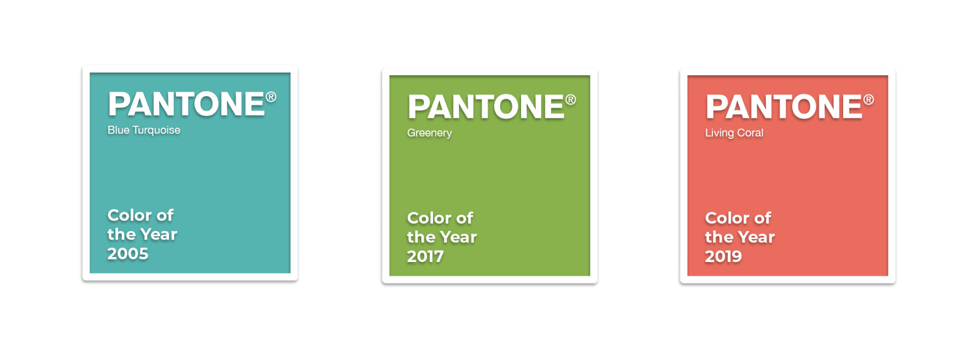
The Pantone Colour of the Year is a trend inspiration for branding, marketing and creative society as a whole. Every single colour is unique, and often takes its inspiration from Mother Nature.
We used this insight to create awareness about the effects of climate change on the environment.

This campaign was created to confront the real issue at hand:
---------
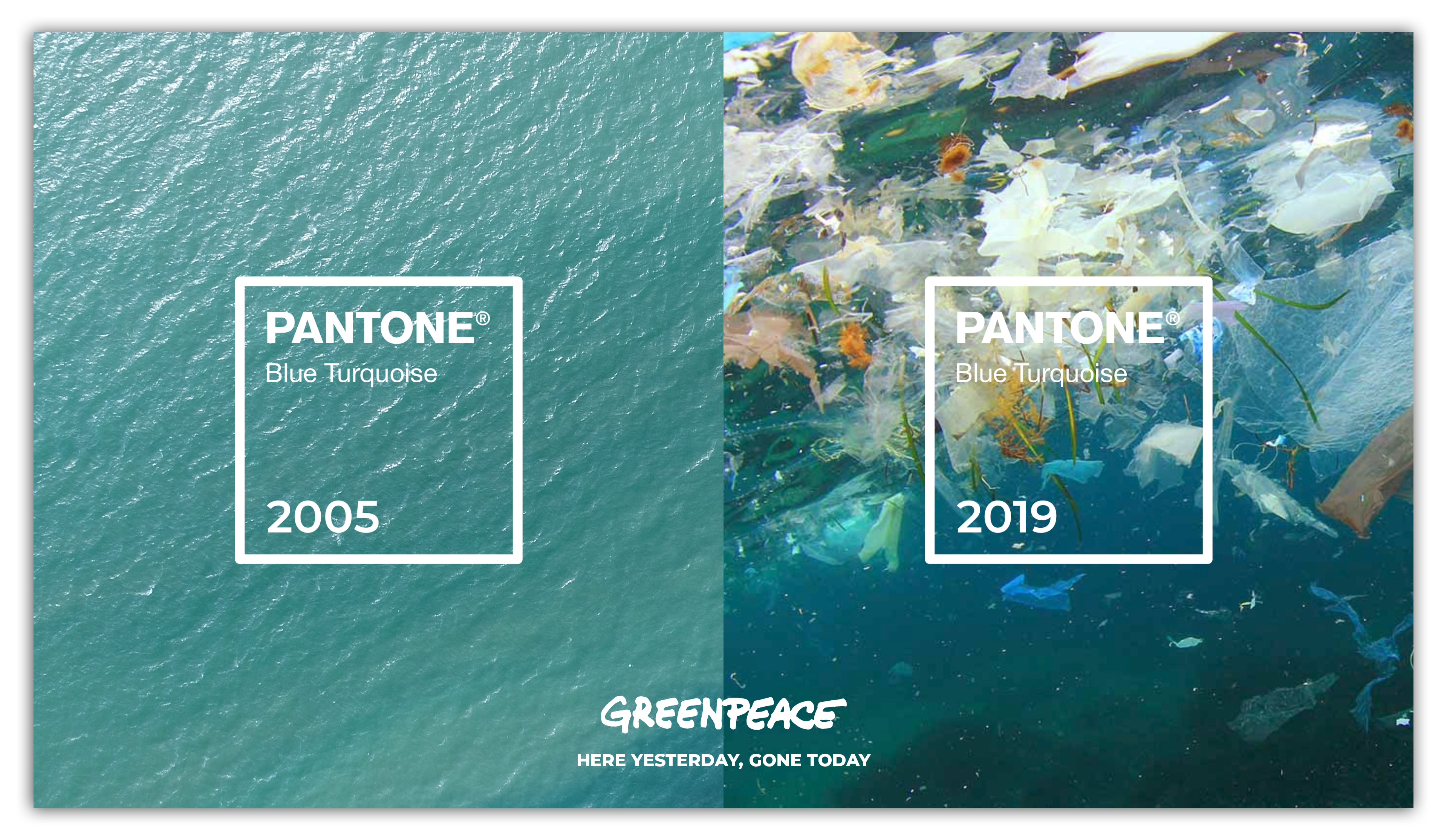
By 2050 it's projected that there will be more plastic in the ocean than fish.
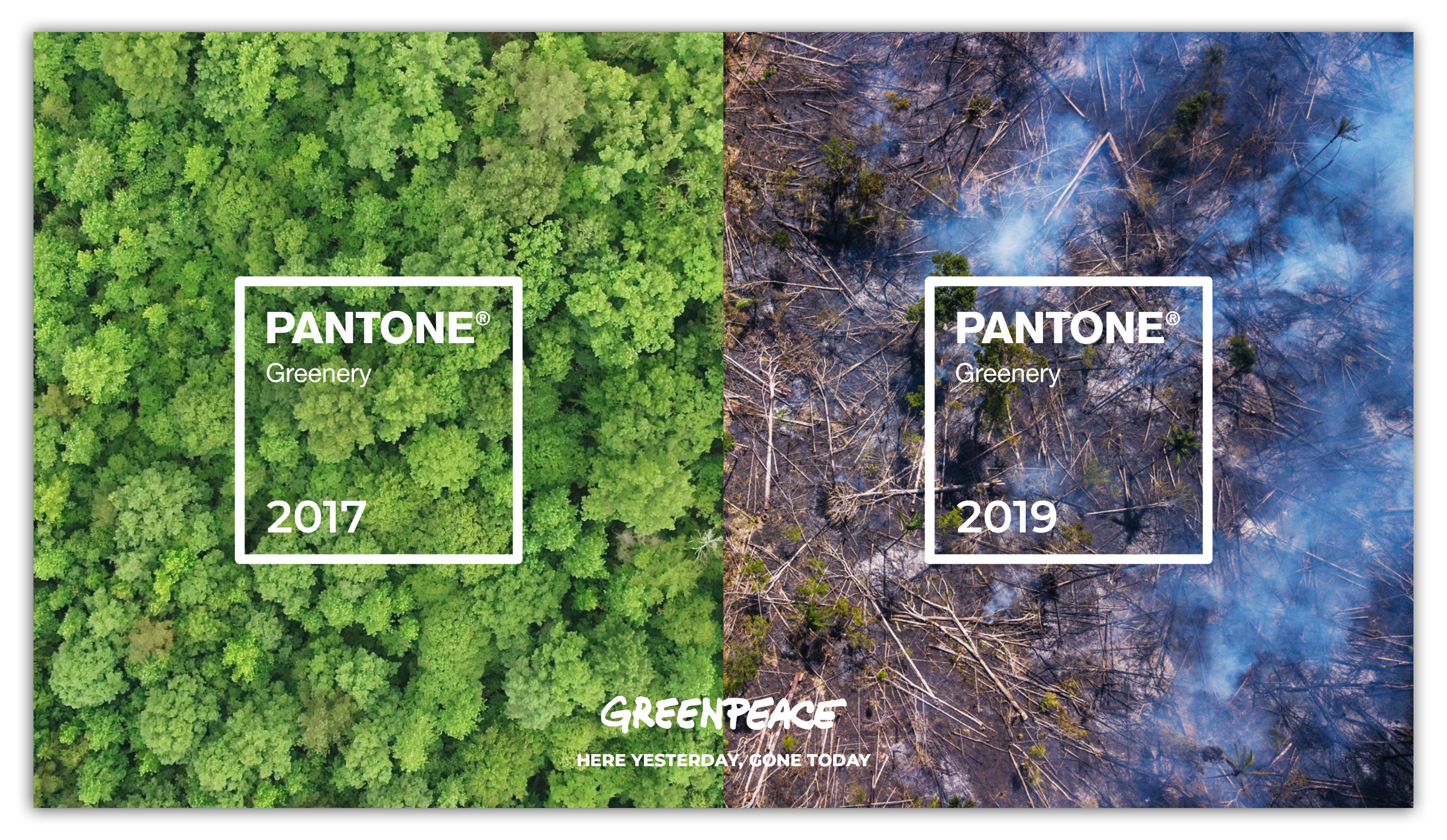
The number of forest fires in the Amazon Rainforest has surged by 145% since 2018.
20% of the world’s coral reefs have been "effectively" destroyed, with no immediate recovery prospects.
---------
P.S: This project was originally created in 2019, and here I am writing this in 2024.
It's sad to realize that these challenges remain as pressing as ever. These problems still persist, even now.
It’s a sobering reminder of the world we live in.
It's sad to realize that these challenges remain as pressing as ever. These problems still persist, even now.
It’s a sobering reminder of the world we live in.
OOH Billboards
Pantone Colour of the Year 2005 Blue Turquoise - Represents inspiration from nature and the clear ocean.
-----
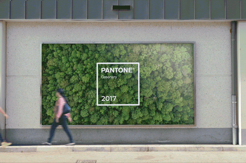
Pantone Colour of the Year 2017 Greenery - Evokes the first day of spring when nature's greens revive, restore and renew.
-----
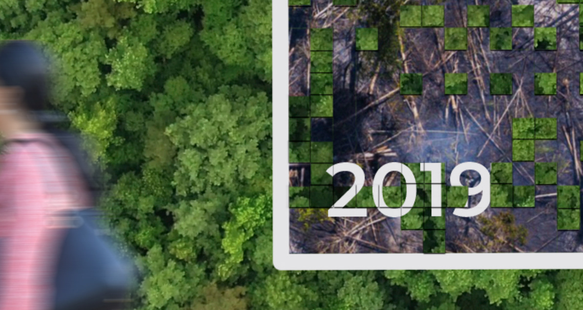
Pantone Colour of the Year 2019 Living Coral - This represents the ability to fill ourselves with light and life, expand without ego, trust our community, and embrace togetherness and oneness to build something beautiful and bigger than ourselves.
-----

OOH Billboards
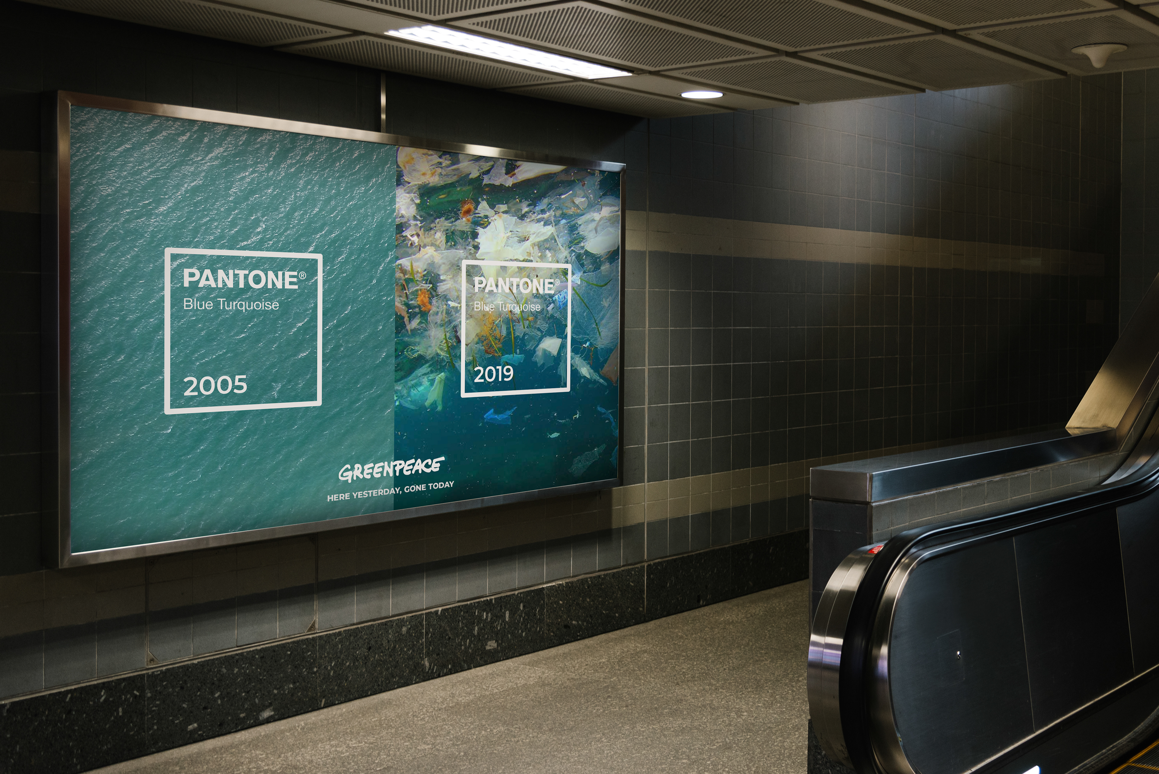
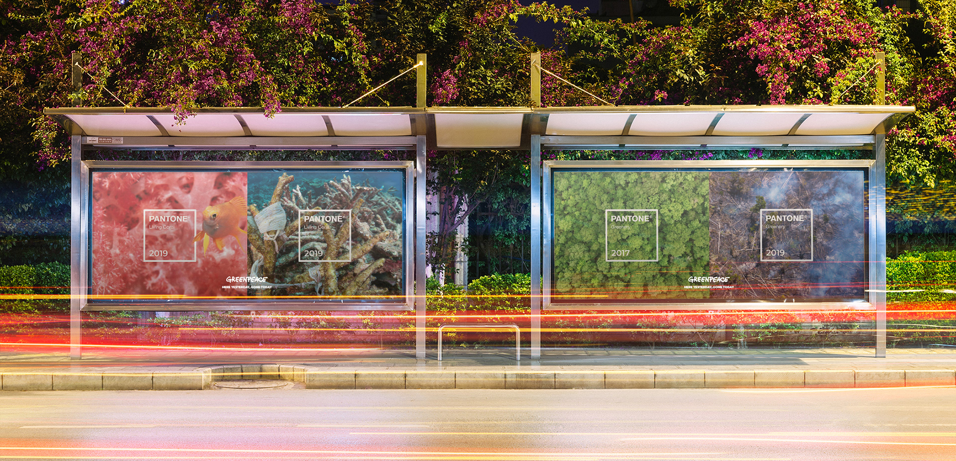
Call To Action / OOH Billboard
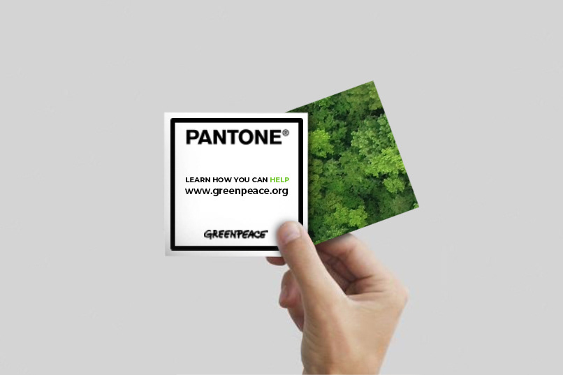
The PANTONE logo poster is composed of removable stickers people can interact with. As the top layer is partially removed, the "real" photo will be exposed.
The backside of the sticker will have a link encouraging people to take action and learn more about the case.
m